
High traffic doesn’t equal high revenue. Hire a Housewife had the traffic part figured out. The conversions? That was the problem.
High traffic doesn’t equal high revenue. Hire a Housewife had the traffic part figured out. The conversions? That was the problem.
Hire A Housewife’s founder, Natasha’s instinct was the same as most business owners in that position: spend more on ads. More traffic = more leads = more revenue.
We looked at it differently. Scaling ad spend works in theory, but if your conversion path is broken, you’re just scaling an expensive problem. Your cost per lead keeps climbing until eventually you’re spending more to acquire a customer than they’re worth. That’s when businesses start to grow broke.
We decided to focus on the most impactful actions first: fix the conversion rate, then scale sustainably. “Your traffic’s not the problem,” we said. “Hire a Housewife’s not converting the traffic you already have. Let’s fix that first.””
So we dug into the site & found the real problems:
The issue was friction. It was hiding in the UX.
Here’s where it got interesting: the Squarespace theme Hire a Housewife was using had limitations that made certain UX improvements difficult to implement. We couldn’t restructure the navigation the way the data suggested we should. We couldn’t reorganise the service pages as cleanly as needed. It wasn’t that the platform was wrong – it just didn’t have the flexibility to execute the solution we’d diagnosed.
So we made a strategic call: we’d rebuild the site with a new Squarespace theme that gave us the flexibility to actually fix the conversion problem. The redesign wasn’t the solution. The UX improvements were. The new theme was just the tool that let us make them.
That’s when the real work started.
When we dug into the site, we found 18 different service offerings spread across 18 separate pages. Weekly Clean. Window Cleaning. Carpet Cleaning. Lawn & Garden Cleaning. Soft Washing. New Build Cleaning. Hoarder Cleaning. Pre-Paint Cleaning. Decluttering. & more.
Picture this: You land on the homepage looking for a weekly clean. You find the Weekly Clean page & it looks good. But what if you also want window cleaning? Or carpet cleaning? You’d have to navigate away from that page, hunt for the other service, then figure out if it can be combined with your weekly clean.
Or you’re looking at Weekly Clean & wondering what else Natasha offers that you could add to your package. But you can’t see it from that page. You have to leave, search for it somewhere else, then come back.
Worse: you’re looking at a service page, you’re ready to book, & there’s no way to convert without navigating away to find a contact page or form. You have to make another decision. You have to leave the page. That friction alone kills conversions.
The actual problem: Visitors landed on a service page, but couldn’t see the full picture of what was available. They couldn’t easily compare options or understand how to combine services. & when they were ready to convert, they had to navigate away to find the form. The friction came from information being spread across separate pages instead of grouped where people could see it all at once. The analytics backed this up. 58% bounce rate on service pages. That’s not a design issue. That’s a friction issue.
What we did: We consolidated all 18 services into organised category pages. Now when you click Domestic, you land on one page that shows every domestic service Natasha offers.
We added anchor buttons at the top ([Weekly Clean], [Window Cleaning], [Carpet Cleaning], etc.) so visitors can jump straight down to exactly what they need. No hunting. No bouncing between pages.
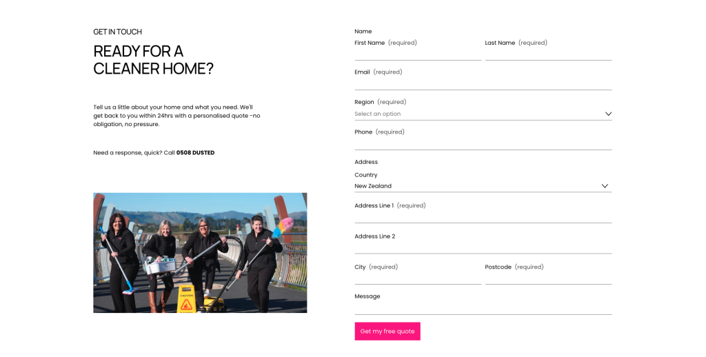
We put the form at the bottom of every page. Visitors can convert without navigating away.
The outcome: Everything needed to make a decision & book is on one page. Visitors can see all their options at a glance, compare what’s available, understand what they can combine, & convert. No friction.”
The service descriptions were running 400+ words each. They talked about “high quality products” & “top-tier cleaning equipment” & how everything was “personally tailored to your needs.”
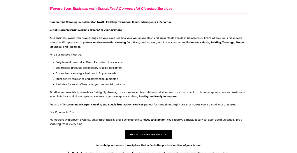
But nowhere in all that did they actually answer what the person visiting actually wanted to know: what’s going to happen when I book this, & when will you get back to me?
The trust signals (insured, locally owned, screened professionals) appeared three or four times on the same page. Which suggested the copy was written to tick keyword boxes rather than actually help someone figure out if this was for them.
The actual problem: Too much copy creates cognitive overload. People skim, get overwhelmed, & leave. You don’t convert by talking at people about how great you are. You convert by answering their question.
The buttons asking people to book a quote were scattered through the copy. Different wording across different pages too. “Get in touch.” “Book now.” “Contact us.” Nothing consistent, nothing that made it obvious what the next step actually was.
The actual problem: When every page has a different CTA, visitors have to stop & think about whether they’ve found the right button. That friction alone kills conversions. People want to know what to do next. Make them guess & they’ll leave instead of booking.
We didn’t start by redesigning the site. We started by mapping what a visitor actually needs to do to book a clean. Then we worked backwards.
Eighteen services scattered across nine menu items is information architecture designed by someone thinking about their business, not their customers.
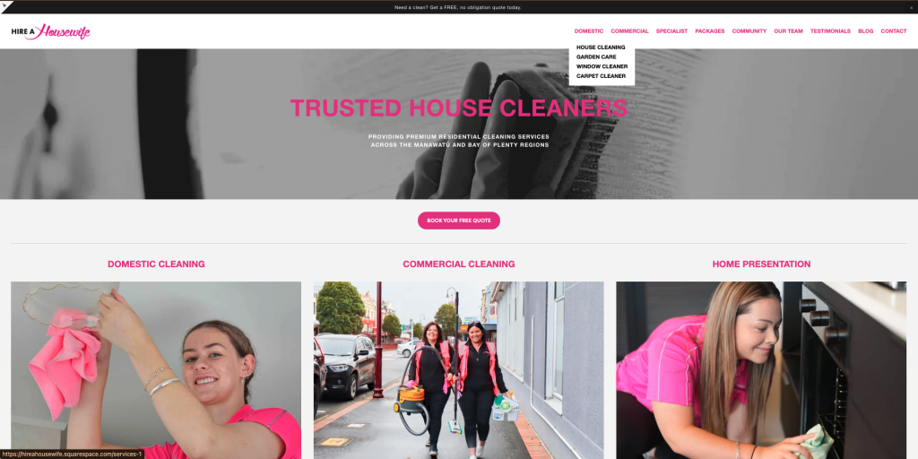
We consolidated those 18 offerings into four clear categories: Domestic, Commercial, Specialist & Packages. Secondary stuff (About, Community, News) went into a separate folder so it didn’t clutter the path to conversion.
Now the journey is simple. Click Services. Pick your category. Find your service. Click the button. Done.
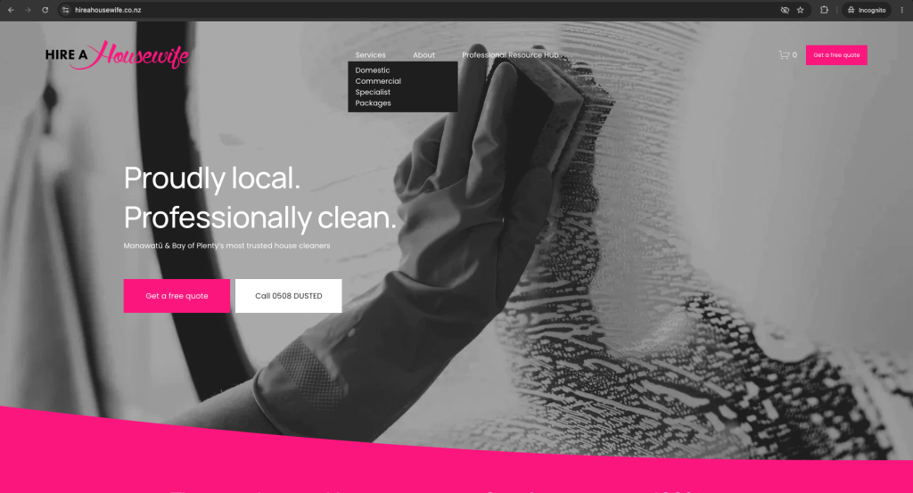
Every service description got a rewrite. Instead of leading with features, we led with what it actually solves for them.
“Regular, reliable care tailored to your family’s needs” instead of “high quality products & top-tier equipment.”
We showed exactly what’s included in a scannable bullet list. One trust statement at the end instead of scattered throughout. One clear CTA.
Cut the word count down from 400+ to around 150 words. Visitors can actually scan it in under ten seconds.
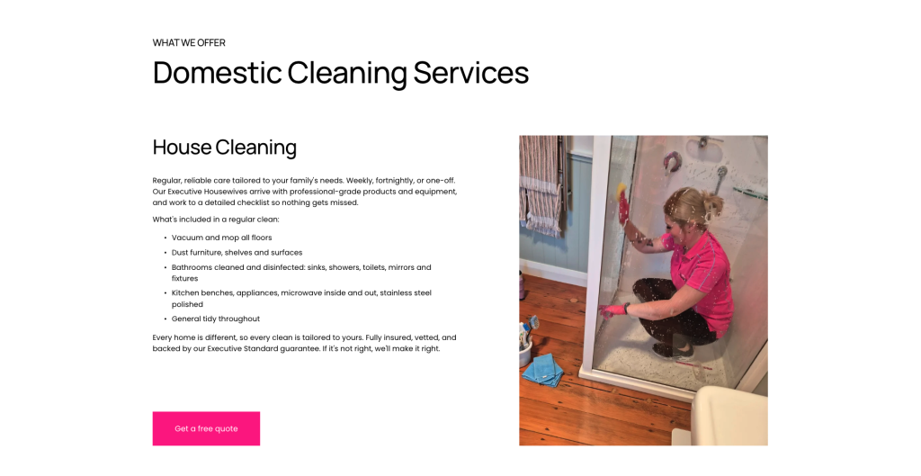
Every single service now has the same button in the same place: “Get a free quote.” Same styling. Same copy. No guessing.
When every page has different wording & different button placement, visitors have to stop & think. That’s friction. Consistency removes that friction.
One thing we kept hearing: people want to know how long before you hear back.
So we made that promise visible. Twice. On the form itself & on the confirmation page: “You’ll hear back within 24hrs.”
That’s one less thing for someone to worry about. One less reason to bounce. One less objection to overcome.
Before: 9 top-level items stacked next to each other (Domestic, Commercial, Specialist, Packages, Community, Our Team, Testimonials, Blog, Contact) plus sub-items under most of those.
After: 3 main folders (Services, About, Professional Resource Hub) plus a Contact button.
What you lose: Navigation chaos. What you gain: The path from “I need cleaning” to “I’ve booked cleaning” becomes obvious.
Before:
After:
Here’s a real example of what changed.
Old version: “Whether you’re after a trusted weekly cleaner or a one-time deep clean, Hire a Housewife is your go-to domestic cleaning specialist in Palmerston North, Feilding, Tauranga, Mount Maunganui & Papamoa. We provide regular weekly or fortnightly cleaning, as well as one-off deep cleans, all tailored to suit your schedule, your home, & your lifestyle. Our professional Executive Housewives arrive with high quality products & top-tier cleaning equipment, ensuring every job is done to the highest standard safely & efficiently…”
New version: “Regular, reliable care tailored to your family’s needs. Weekly, fortnightly, or one-off. Our Executive Housewives arrive with professional-grade products & equipment, & work to a detailed checklist so nothing gets missed.”
The old version is telling you how great they are. The new version is answering your question: can you clean my house regularly & will I know what to expect? That’s why one converts better than the other.
Before: Form doesn’t say how long it’ll take to hear back. Trust signals scattered across different pages.
After: Form says “You’ll hear back within 24hrs.” The confirmation page says it again. Every service page has the same “Get a free quote” button. And the trust message is simple: “Fully insured, vetted, backed by our Executive Standard guarantee.”
We didn’t just reorganise the existing stuff. We added a strategic layer to what Natasha’s offering.
The new site includes a place where Natasha shares actual industry expertise. Pro cleaning tips, advice for other professionals, stuff she’s learned in 24 years of running a cleaning business.
Why? Two reasons. First, it’s SEO value. Regular content about professional cleaning positions her as someone who knows what she’s talking about. Second, it’s positioning. A visitor doesn’t just see “book a clean.” They see “this person actually knows the industry.” That shifts how they perceive the business. That builds authority. Authority converts.
We also built out a B2B offering. Coaching for other cleaners, property professionals, people in the industry who want to learn from someone with two decades of experience.
Again, this does two things. It adds another revenue stream. But more importantly, it reinforces that Natasha’s not just offering a service. She’s an authority. She’s trusted enough that others pay to learn from her.
People book services from people they trust. Trust comes from seeing expertise, not just from seeing a nice website.
Here’s the thing this case study shows you:
When a site’s got bucketloads of traffic but conversions are sitting at less than 1%, it’s almost never a design problem.
It’s friction. It’s hiding in the places you don’t expect. Information architecture that makes visitors decode what you actually offer. Copy that talks about you instead of answering what they need. CTAs that are inconsistent or buried. Objections nobody’s bothering to kill upfront.
The framework that worked:
Do this work before you redesign. Do this before you spend money on paid ads trying to force traffic to a site that doesn’t convert.
The diagnosis is where the real work happens. Everything else follows from that.
One thing we always tell clients: a good website isn’t something you build once & leave. It’s a foundation.
For Hire a Housewife, we’ve got a solid base now. The friction is gone. The conversions are moving. But there are plenty of opportunities to keep improving it. Better social proof on specific service pages. Testimonials from customers who use each service. Additional conversion paths we haven’t tested yet. Content that brings in organic traffic & positions Natasha as the authority she is.
The website we launched is the foundation. The real work is the ongoing optimisation that comes after it. That’s where the best results actually live.
This is the approach we take at Connect the Dots. The site has traffic, but conversion metrics are stuck? We dig into what’s actually breaking. We find the friction. We fix it.
If your site’s got the same problem, let’s have a chat about what’s actually going on.
Book a consultation or reach out directly. We’ll walk through your user journey & show you exactly where the friction is living.
9 minutes

Head of Experience Design & Marketing Strategist
Brand designer with a conversion mindset.
Bringing 7+ years of brand design and marketing experience, with a passion for understanding what makes a customer tick.
Hannah designs experiences that look and feel good while lifting conversion, deepening brand presence, and growing profit.